Introduction
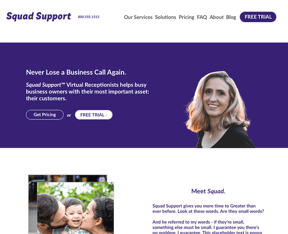
Business shouldn't stop just because you got interrupted by a phone call. That's why Squad support was created. Since time was the most important asset to our audience, the hero had two main functions:
- Be easily accessible - Displaying the 800 phone # immediately for prospects who want to talk to a representative right away
- Remove risk - I visibly call attention to the 7-day free trial CTA, encouraging the prospect to consider our offer by continuing to de-risk objections they may have
Transparent plans with no hidden fees

Have you ever navigated to a pricing page, only to see a "contact us" for a quote?
No bueno. Rather than go through a whole dog-and-pony show and frustrating the prospect, we decided the pricing page should break down to only three packages.
Don't overwhelm the visitor with too many choices.
Keep it simple. Give them what they want.
For special cases, I created a big call out with accompanying CTAs which asked them to reach out if they want a custom plan.
Agent recruitment funnel

In order to balance out service demand, I created a similar funnel for agents interested in working with us.
To filter for qualified candidates, I designed the UX to first display activities and situations they may face - to be upfront.
Certain individuals who may not enjoy working on these types of tasks and it is in everyone's interest to disqualify early.
Augmenting this messaging is a set of criterion bullets which speak to what the company is looking for. Now we're getting into the nitty gritty details.
I rounded out the copy by calling attention to what a team member may experience on a day-to-day basis as examples in order to "bring it home" and connect abstract requirements to real world scenarios.
Color Palette & Typographical Scale

For this project, I identified two key colors with strong contrasts that would complement well with subdued backgrounds.
The primary, I used Meteorite (#382174) with Mandy (#ed4a62) as an accent.
For font-pairing, I choose Intro Cond in Black Italics as the typeface of choice with Lato as the supporting secondary.
Tying it all together is scale choice.
With a body size set to 1em (16px), I decided to scale everything by 1.2x Minor Thirds between H1-H6 to maintain vertical rhythm.
Lead generation with a Blog

Each blog post provides an opportunity for the business to connect with prospects that are looking for their service offering.
The eyebrow CTA is meant for returning visitors.
They may have came from LinkedIn, Facebook or Twitter and have already consumed or engaged with their content.
Establishing a regularly publishing cadence, I wanted to convert anonymous social media visitors into "owned traffic" by providing a consistent, top-of-mind location for them to sign-up every time they visit.
See for yourself: Squadsupport.com.
Can I help with your web design & development project?
Let's have a friendly chat and find out
or