Introduction
The BILL REN personal brand was created to provide a glimpse into my background, work experiences and some hobbies and activities I enjoy.
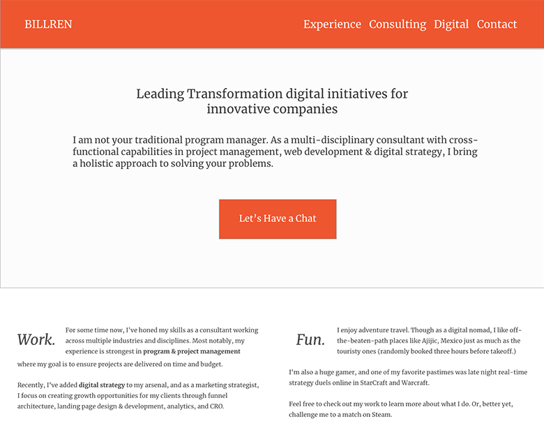
The Hero space prominently called out what I do & who I am -- with a strong CTA to setup a time to connect with me right away.
Traditional resumes are "stuffy" and often times, boring to read. The goal was to highlight my skillset in a more vibrant, yet skim-able fashion as a way to show my personality while connecting with the audience.
Easy to read work experience
Pick and choose based on your interest

Think about how work experiences are typically presented. It is usually long. Black and white. And contains a lot of day-to-day details.
But what if you could simply highlight what you did in a quick and scannable manner? What if each headline contained a visual cue that made it easier to identify what your work was about?
This is why I created my work experience in a a grid format that led with a 1-liner that summarized what I accomplished.
The TL;DR quick & dirty

For experiences that pique the interest of the reader, I designed this layout to address the key questions that people would want to know:
- What this project was all about
- A bulleted list of what I did
- Followed by a quick summary of how I added value
- Concluded by key success metrics and outcomes
If they are interested to learn more... Two CTAs are prominently displayed at the bottom.
Book an appointment, or call me (maybe.)
Clean and simple portfolio

I created this portfolio archive UX to be as distraction-free as possible.
Ample white space, with a simple 1-liner explaining what I designed, for whom or which project, and a large thumbnail of the comp. makes the browsing experience less "busy."
See for yourself: BILLREN.com.
Can I help you build your personal brand?
Let's have a friendly chat and find out
or