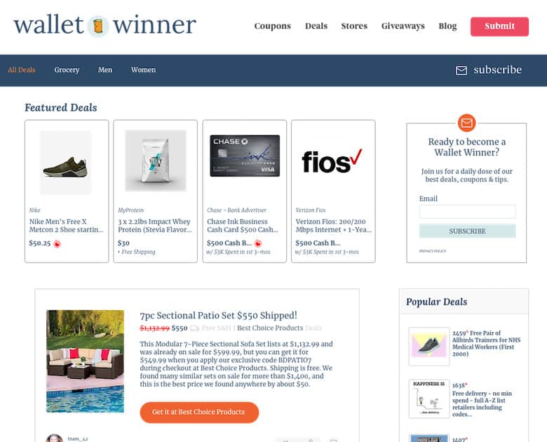
Introduction
The goal of Wallet winner is to help the readership save money on their everyday purchases while also providing a fun destination for visitors to engage with giveaways and win household prizes. Research has shown that there is a significant overlap between the giveaway & sweepstakes audience and the online deal hunting viewership. I delineated the top navigation with a simple and clear menu. This signals to the visitor what we're about. A bright CTA draws the visitor's attention to submit a crowd-sourced deal. We wanted this be more of a community rather than a one-way channel. An email list widget and paired with the "subscribe" CTA above the fold targets the "Impulse buyer" behavioral segment of the visitor traffic.
Clean and simple way to enter a giveaway

For a giveaway, there are three key pieces of information a visitor needs to know immediately.
- What they'll win
- A visual depiction of the prize
- Can they still enter
By prominently calling out the prize, its monetary value, and entry deadline - I surface those data points instantly for the visitor to take their next action.
Details on how-to enter and consolation prizes are below the fold in order to minimize distraction from the primary goal of the user.
Quick access to redemption info.
For all your deal details

In deal details, I designed the experience in order to give the visitor a "Heads Up Display" of the discount their product or service is saving them.
The MSRP retail price is stricken out and placed next to the deal price (in bold.)
A percentage off calculation is added for emphasis.
Large, attention grabbing CTA and optional, corresponding coupon code present in the hero for ease of accessibly across both desktop and mobile form factors.
Last, but not east - the actual item description and redemption instructions.
Naturally, if the item and savings pique the visitor's interest, then they are more apt to spend the time to read more about it and move forward with the purchase.
Conslidating a curated list of coupons

I wanted to present coupons at the store-level in a simple list format that is easy for readers to consume and take action.
Often times, the visitor just wants to get a discount or save a few dollars.
So the UI reflects a straight-forward design where the store is presented in the upper left and the coupon and promotional codes are listed below.
Each card contains all of the relevant decision drivers necessary to move the visitor to redeem the coupon at the destination store.
Can I help you create UX wireframes for your digital project?
Let's have a friendly chat and find out
or